There has been a lot written recently about how some diseases cost the healthcare system more than others, and the fact that some patients (the sick ones and the old ones) cost more than others. I wanted to learn more about which clinical conditions are the big contributors to our national healthcare bill. So, for the purposes of this post I pretended I was an accountant, responsible for thinking about where to save money in the USA’s health budget. Here is what I learned.

My interest in this topic is part of my quest to identify new opportunities that I believe will arise as a result of turmoil and reshaping of the healthcare landscape over the coming decade (more on this topic here). It’s not that I think there is anything especially surprising or worrying about the fact that healthcare expenditures flow more to some diseases and patients than to others. To me that seems only to be expected. However, I do believe there is going to be increasing pressure to reduce costs, and that the logical places to look for new opportunity are where lots of money is presently being spent.
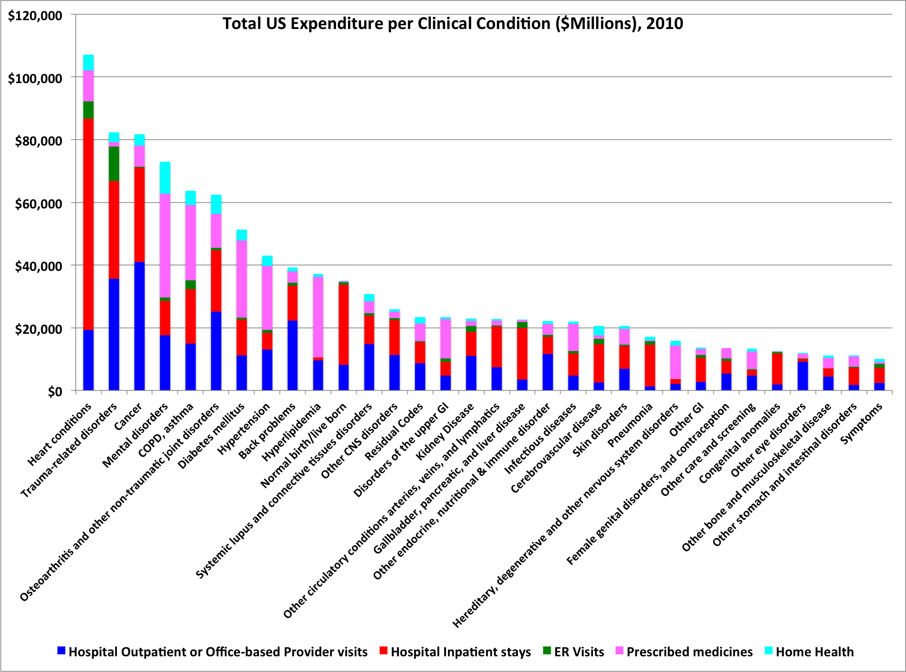
Top 53 clinical conditions ranked by cost
Unsurprisingly, heart disease, cancer, and trauma are the three biggest ticket items. I found some of the other big categories a bit surprising. Food for thought.
Costs are concentrated in a small group of clinical conditions
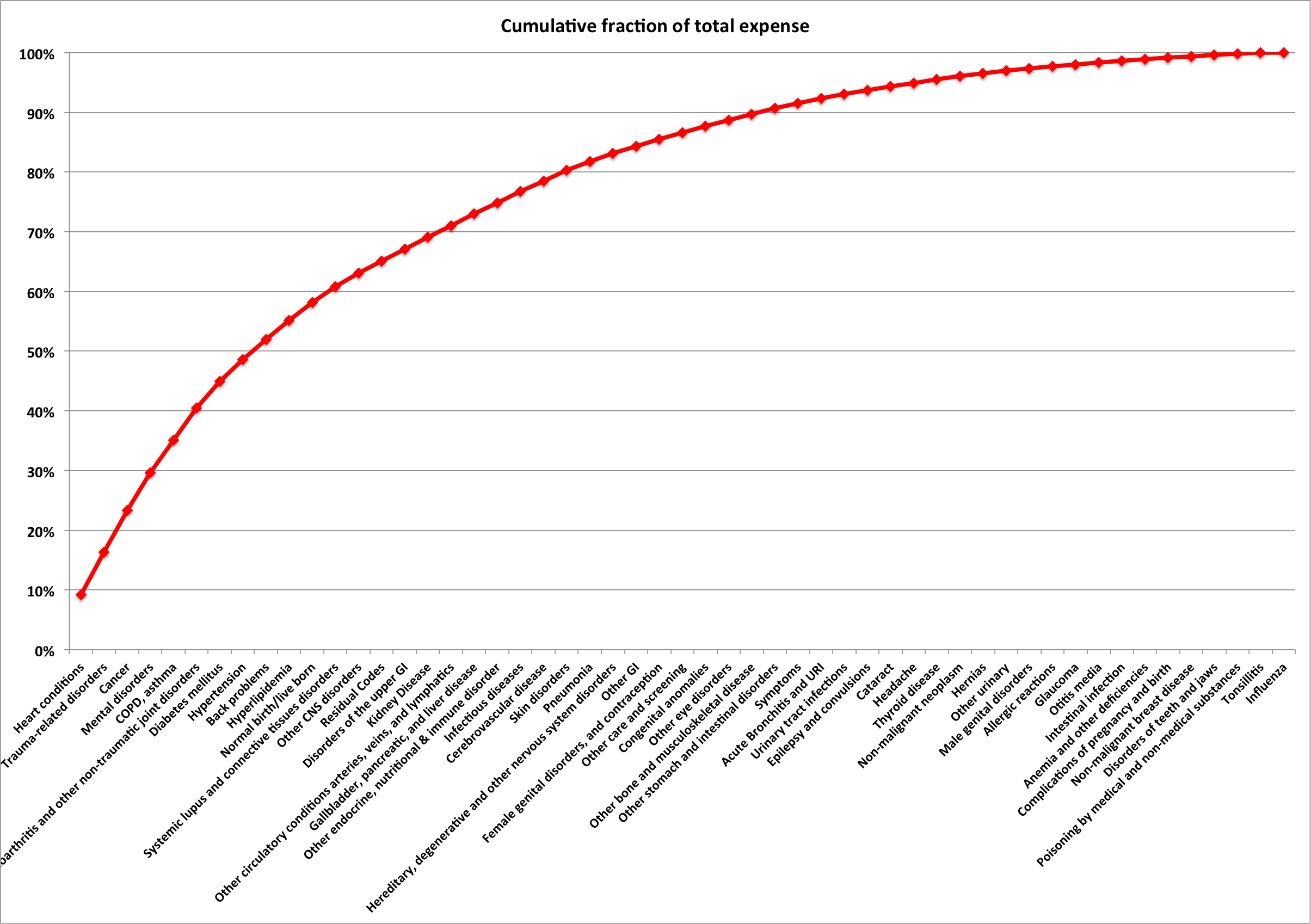
The figure below shows that 8 of the 53 clinical categories (see reference section for discussion of where the data comes from etc) made up about 50% of the total expenditure. And that almost 75% of the total expenditure came from the top 19 clinical categories. So, my hypothetical accountant immediately has some ideas where to look for economies.
Hospitals, Pharma, and Outpatient have different perspectives
It is striking how varied the locations of costs are between disease, if one reviews the different color bands in the graph at the top of this section. For example, by far the largest portion of costs for heart disease fall in to the “hospital” bucket. In contrast, much of the costs for hypertension, diabetes, and hyperlipidemia (obviously a relative of “heart disease”) fall in to the “pharmaceutical” bucket. And Back problems have a large component of costs in the “outpatient” bucket.
My hypothetical accountant would need to attack drug costs to impact the costs of managing hyperlipidemia. To impact costs associated with heart disease, one would need to tackle the costs that occur in hospitals. And of course, one person’s cost is another person’s revenue.
High healthcare costs are not necessarily bad
I think it is rather important to remember that high costs are not necessarily bad. What matters is whether we are happy with the results from those high costs.
One often gets the sense from articles about healthcare costs that it is simply a question of identifying where the big costs are and then focusing on reducing them. If that were the case, then from the graphs above, heart disease would be candidate number one for cost reduction. But if you look at the figure below, it is clear that our healthcare system has made great progress over recent decades in reducing death rates from heart disease. So, before suggesting changes, we need to think long and hard about the negative impact of those changes.

In my view, what we need is cost reduction while maintaining or improving quality of care. This is unlikely to come from cost cutting, and most likely to come (I hope) from disruptive innovations that change the way we do things.
Conclusions
- If one could find a way to reduce substantially the costs in one of the big disease cost categories, without reducing quality of care and outcomes, that would be quite important in the context of a nation with runaway healthcare costs.
- So, in terms of new opportunities, one should get excited about ideas that fit that profile.
- The top 5-10 clinical condition categories seem worthy of special attention.
- If we move toward explicit or implicit rationing of healthcare, as is done in many other countries, then the top 5-10 clinical conditions seem likely to attract the attention of the rationers.
References and footnotes
- The data in the graphs above comes from a series of tables and reports available at the Agency for Healthcare Research & Quality (AHRQ). The data come from a series of surveys (MEPS: Medical Expenditure Panel Survey) of a large sample of households and medical providers in the USA, and are designed to represent the overall breakdown of US health expenditures. All data in this post is for 2010.
- The total amounts captured in the AHRQ analyses differ somewhat from the numbers in the NHEA (National Health Expenditure Accounts) analysis I have used in prior posts. This difference is analyzed in detail by Bernard et al (PDF here). The key details are as follow.
- MEPS measures only a subset of the things measured in NHEA. In particular, MEPS is really measuring something very similar to the “Personal Health Care Expenditure (PHC)” subset tracked in the larger NHEA measures. Basically, NHEA includes PHC plus additional amounts associated with government administration, Net cost of private insurance, Government Public health activities, and “Investment”. MEPS does not include these extra expenses. In addition, MEPS excludes the institutionalized portion of the population and the active military, whereas these populations are included in PHC numbers.
- After correcting for these difference, Bernard et al are able to reconcile MEPS and PHC to within 18%, which seems sufficiently precise for this discussion. Before this correction, total PHC expenses for 2010 were $2.2 Trillion, whereas total MEPS expenses for 2010 were only $1.2 Trillion.
- My conclusion from this reconciliation is that if we care about accurate total expenditures, we should use the larger PHC numbers. But for looking at the relative amounts spent on different diseases, we can happily use the MEPS data I have used in this post, bearing in mind that absolute numbers for each disease are likely quite a bit bigger, perhaps as much as 80% bigger.

Leave a reply to Disease economics: COPD and Pneumonia – science to profits Cancel reply